LaineyGossip site update: New Mobile Site Launch


UPDATE: Scroll to the bottom for updates to new issues/questions some of you have raised
We’re excited to launch a new version of our mobile site this morning. If you’re reading this on a mobile device, you’re probably already aware of that.
The new site is quick, easy to navigate, and relatively intuitive, but we want to point out a couple of things to make the transition easier. You will also find more ads in this version, but we hope you understand that it enables us to invest in our strong team of writers and help Lainey to continue to champion diverse voices online, as well as grow the site’s technical/creative elements. Digital publishing has been under market pressure for quite some time and has also made efforts to be more transparent. These costs require more avenues to generate the needed revenue and we hope you understand and support us in that effort by navigating these ads.
In general, the new mobile site behaves like an app. You can navigate from section to section, article to article, and photo to photo with either a left or right swipe. If you enter an article in the main “Gossip” page, you can navigate to older or “lower” posts by swiping left, and newer or “higher” posts by swiping right. The same is true in Lifestyle, etc. And you’ll still find the day’s intro near the top below the newest articles scroller.
You can also navigate from section to section of the site with swipes, or by touching the menu at the top. If you choose to swipe, you’d swipe left from the Gossip home page to go to the Lifestyle home page, for instance.
Photo galleries work the same way. Photos that are associated with an article are at the bottom of articles as usual. Tap on a photo to launch the gallery and swipe left or right to view them. You can tap on a photo from within the gallery view to zoom in, and tap it again to snap back to the gallery view. Once you reach the end of a gallery for a given article, you’ll notice that you can jump right into the next article’s photo gallery. It’s easy to spot because you’ll also see the title below the photo change to the title of that next article. At any time you can jump back into the article by clicking “Back to Article” in the top right corner.
If you get lost within the site at any point, you can always find the drop down menu floating above the content in the top left corner. From there, you can go to any section of the site and “reset”.
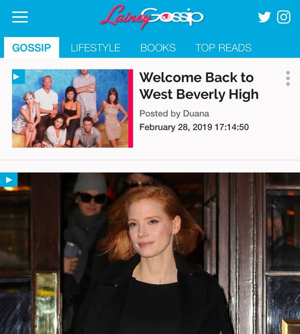
The new site is a faster, cleaner overlay of our old mobile site and we encourage you to use it. If, however, you absolutely cannot and need to use the old version of the mobile site you can jump into the “Classic” mobile site from the drop down menu (see screenshot below) or at the base of articles where you see a link to “Classic Version”. You’ll also need to go classic if you’re looking to go back beyond 30 or so articles (or roughly 3 days of posts), or if you need to access some deeper features such as Search, Archives, Index pages, and other elements that you don’t see on the new site. Again, the link to jump to the old mobile site is always in the drop down menu. NOTE: SEE BELOW - CURRENTLY NOT WORKING AS INTENDED.
Thank you all for supporting LaineyGossip and we hope you like what you see. If you have any feedback or questions please email jacek(@)laineygossip.com.
UPDATED March 13, 12:05pm ET:
Ad Contrast and Frequency
We’ve asked for ads to be marked “Advertisement” since launch day and that has been done. We’ve also requested that ads be put on a slight grey background so they stand separate from content a bit more. Those changes are still pending.
We have also asked for a reduction in how many ads appear overall and it appears the home page is done but we’re still trying to find a good balance on article pages. Some pages have a good balance of ads while others seem crowded and we're looking to find the right formula. On our classic site we manually dropped ad code where we found a good fit, but this was both limiting and time consuming. The new site has logic built in that is supposed to automatically determine where to drop in ads but we're finding it's a bit trigger happy. Apologies if you find it excessive at the moment.
Navigation and Artice Order
The new site is constructed exactly the same way in terms of getting from the oldest to the newest post. The key difference, however, is that the "Next Articles" links on the new site are for posts that are "lower" or chronologically older. So if you are someone who likes to read the intro and then reads the site in the order it was written, you will need to open the post directly above the previous day's intro (just like before) and then swipe to the right (or bring into view the article that is to the left of the post you're reading) to jump to the next post that was posted. Doing that repeatedly will take you through to the newest posts of the day ending with What Else for the day, and the next swipe from there will land you back at the day's intro. So it's the same as before, except instead of tapping "next/previous" llinks you're swiping left and right.
Images/Gallery Navigation
Our old photo gallery viewer let you close the captions and continue to scroll without any obstruction. For the new site, if you want an unobstructed view and/or want to zoom in for more detail you can actually tap the image when in the gallery view and jump to an unobstructed, zoomable level of image view that will remove all navigation elements. Tapping it again will take you back to the gallery view where you can keep swiping more photos. It’s one extra step but there is a way to view just the image.
One thing to note is that when you reach the last image in an article's gallery, the next swipe will take you to the NEXT article's gallery. If you click "Back to Article" once you've entered the next article's gallery, you'll land on that gallery's article, or the article that is after the one you were just reading. Simply swipe right to bring the article you were just reading back into view from the left.
Classic View Navigation
The link to the classic site from the main menu seems to pop new format articles from the old home page. Whereas if you jump to the classic site from the base of an article on the new site (you need to scroll to the bottom waaaaaay past the Taboola units below articles) it seems to work properly and stays on the classic site. We've raised this as a required fix. Once it's done, you should be able to stay on the classic site if that's what you choose to use.
Thank you all for your feedback. We're had a lot of great feedback, some positive some not, but we're hoping that with a few more tweaks and a few more days of getting everyone used to the new format you'll all enjoy the fast, snappy navigation that this new site offers.

